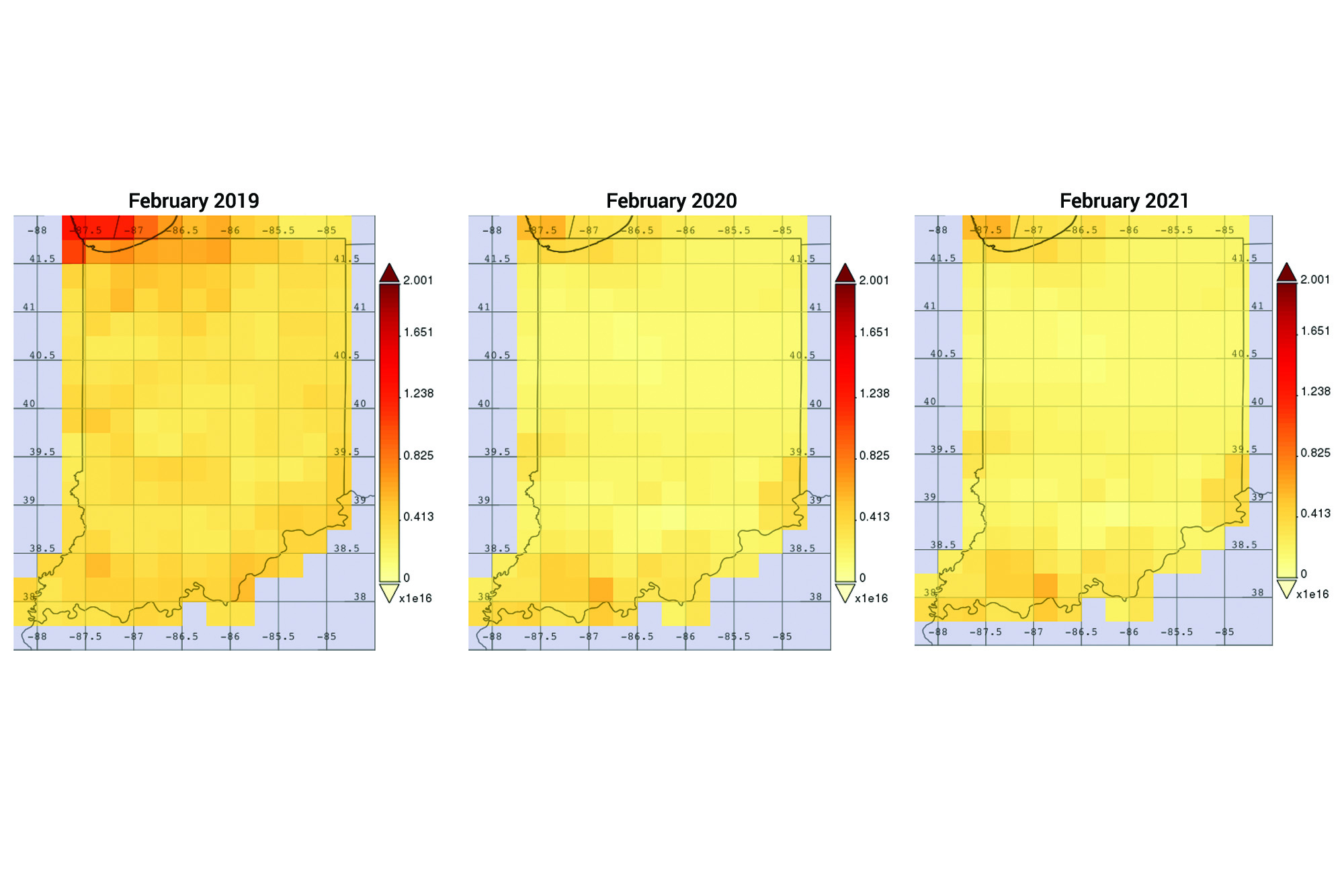
A satellite image showing nitrogen dioxide emissions — which primarily come from cars, trucks, buses, and power plants — in February 2019, 2020, and 2021. (NASA)